
SWELLの購入やWordPressへのインストールがまだの方は以下の記事を参考に導入できます。
あわせて読みたい

SWELLの購入とインストール方法を解説
SWELLの購入とインストール方法を知りたいですか?本記事では、会員登録やDiscordコミュニティへの参加方法、SWELLを使うために必須な認証方法、未使用テーマを削除する理由まで解説しています。SWELLを使いたい方は是非ご覧ください。
こちらの記事で完了すること
- 購入
- 会員登録
- Discordコミュニティ登録
- WordPressへのインストール(親テーマと子テーマ)
- ユーザー認証
- 使わないテーマの削除
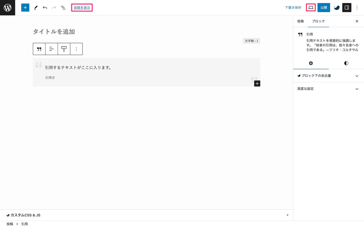
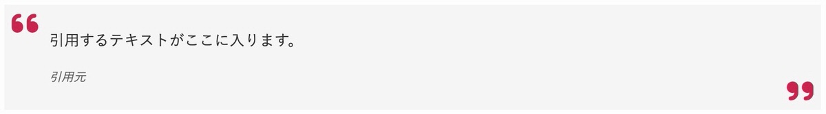
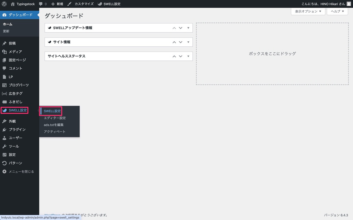
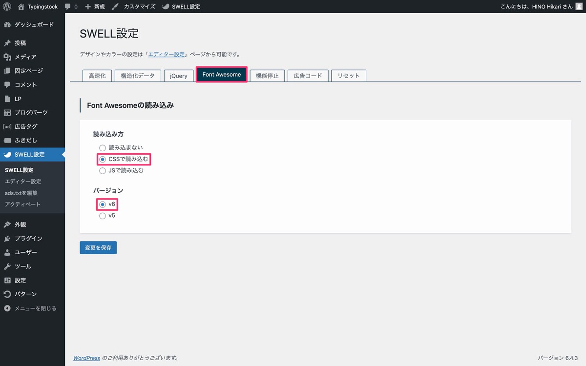
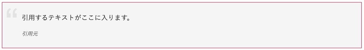
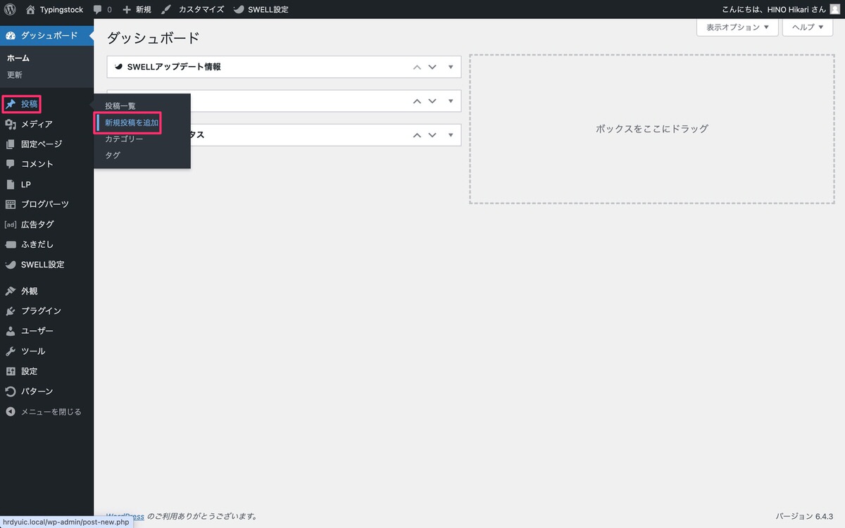
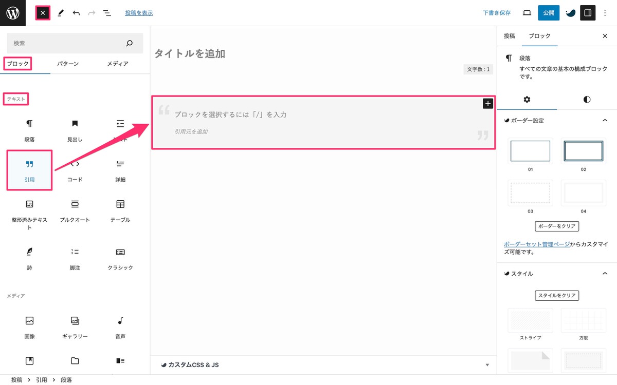
では、本題に入ります。